CassPort Login
As part of my engagement with Cass Information Systems, I began by conducting an independent evaluation of the company’s digital ecosystem to better understand its design patterns, accessibility standards, and overall user experience. Cass places a strong emphasis on creating inclusive, intuitive interfaces for both employees and clients, aligning closely with my focus on accessible UX design.
Early in the engagement, I identified the sign-in experience as a critical touchpoint within Cass’s application suite. To assess its usability and accessibility, I analyzed the publicly available endpoint, inspecting the DOM and evaluating interaction patterns, form structure, and flow efficiency. This initial research surfaced several opportunities to streamline the sign-in process and enhance overall accessibility for a more cohesive user experience.
Process
Code Review, Accessibility Auditing, Ideation, High Fidelity Design, Interaction Design
My Role
UX/UI Designer, Front End Developer
Tools
Areas of Focus
Figma, Visual Studio Code
Accessibility, Semantic HMTL, Visual Design and Layout
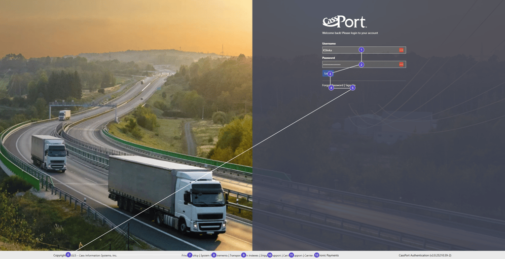
The tabbing order did not provide a clear landmark or context for where the user was.
Critical options like “Reset Password” or “Sign Up” were buried at the end of the tabbing order, which could create confusion for users navigating with assistive technologies.
The styling was a bit outdated
The code didn't include any semantics or arias for the links that open on new pages
👉 At the time, the existing login flow had noticeable accessibility gaps:
Problem and Research
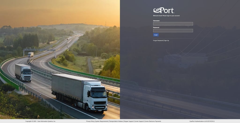
While the login flow did not present major functional issues, it lacked accessibility support and modern polish. During my own testing using NVDA with screen reading and keyboard navigation, I found that the experience was not intuitive or aligned with accessibility best practices- At no point did the screen reader even tell you that you were on CassPort.
In my interview with the Director of Technology, I also learned that the company aspired toward greater accessibility across products. That insight confirmed that addressing accessibility in the login flow would be both impactful and aligned with company priorities. I also reviewed branding guidelines and competitive patterns. This highlighted that the login screen was visually inconsistent and did not convey the same level of trust and professionalism that the company wanted users to feel at the first touchpoint.
👉 Key Insights
The login flow needed a clear tabbing order and better landmarks for screen reader users.
Sign Up options should be earlier in the sign in order instead of at the end.
A more modern and brand-consistent design would better reflect the company’s values and allow for marketing message placement.
The validation service the login screen was built on is an older one so I needed to be strategic to create the illusion of a modern sign on experience without adding extra steps that the service wouldn't be able to handle.
Mapping and Evaluation
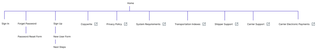
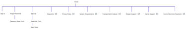
To better understand the existing experience, I created a sitemap of the login flow. This helped me see how the steps were structured and where accessibility barriers, like confusing tabbing order and misplaced actions, were most apparent. As you can see in the diagram, a lot of the links also open in a new tab which is unexpected and not clearly labeled in the UI.
Exploration and Design
Given the straightforward requirements, I moved directly into high-fidelity mockups rather than spending time on low-fidelity sketches. My priority was tabbing order and accessibility landmarks, so I referenced common login patterns from widely used applications to ensure users would find the flow familiar and intuitive.
Validation and Iteration
I created separate annotated designs that clearly outlined the expected tab order, making it easy for developers to reference and implement accessibility correctly during the building phase.
Implementation Materials
I designed the login flow using the latest assets and components from Angular Material, since the application was built in Angular (v7). This ensured that my designs would be consistent with the framework already in place and straightforward for developers to implement without unnecessary friction.
The sign in experience is very important- it's the first user touchpoint and sets the tone for the entire product experience.

Marketing Messages
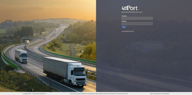
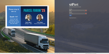
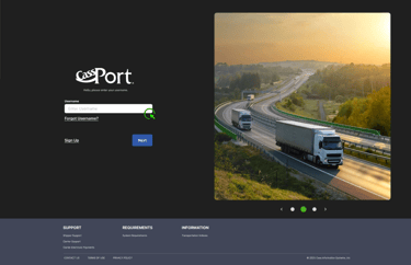
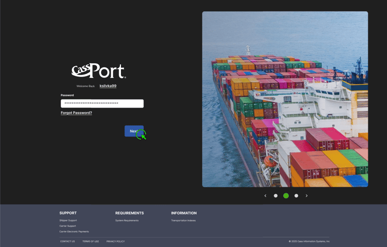
A last minute request was to design a way for marketing messages to be implemented into the design. They don't appear often, but an example of their appearance is below- you can see that there is no designated space or sizing for them, making it hard for the marketing designs to be intentional and seamlessly fit into the overall design.

Results and Impact
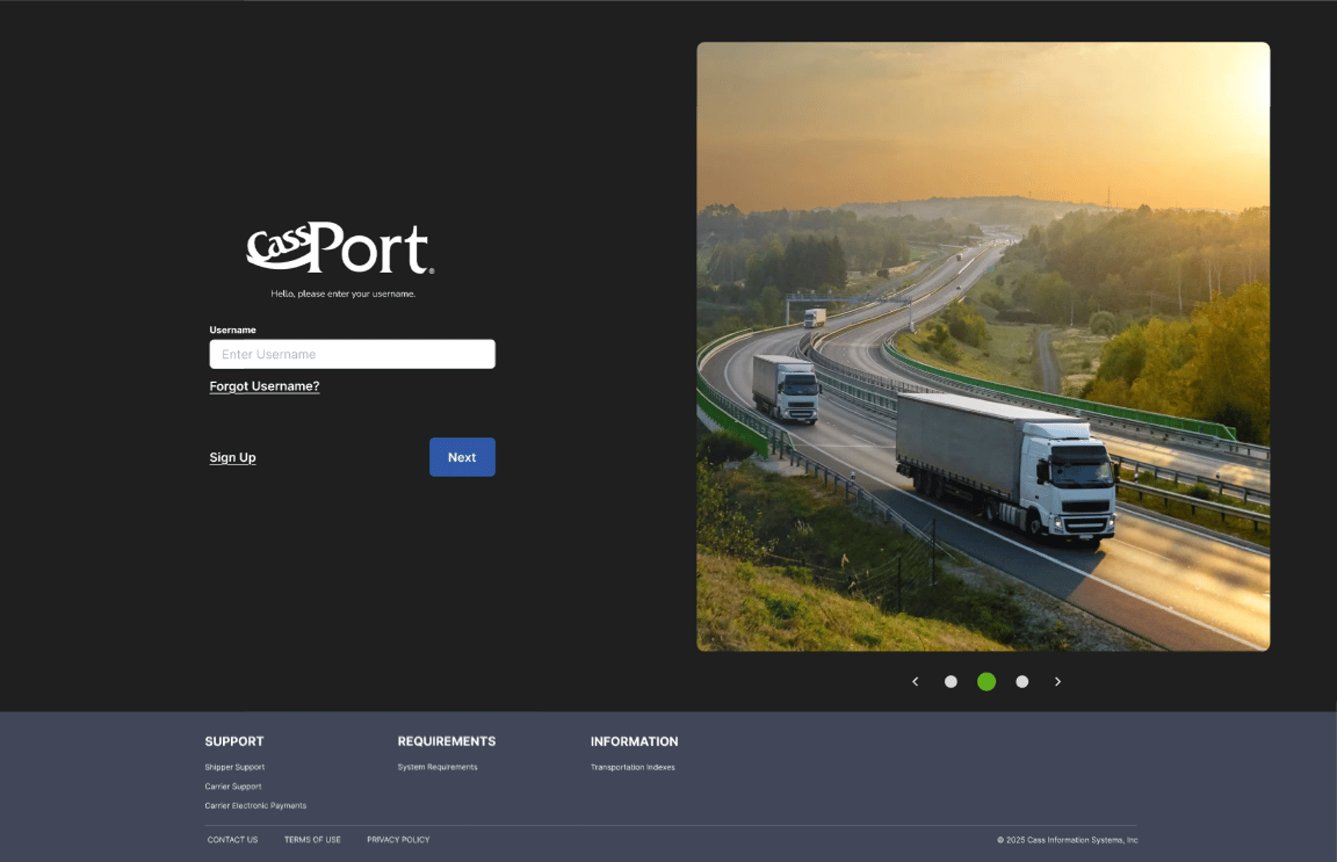
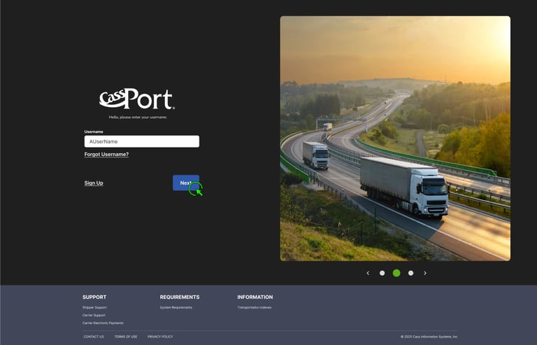
As the design process began, I referenced Cass Information Systems website for inspiration so the new design would be more aligned with what customers already see. I used assets that I created in the design system and referenced branding materials to maintain brand alignment. I also sources images directly from the company website to add variety to the sign in page and increase the resolution of the images for a crisper UI look and feel.

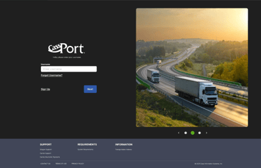
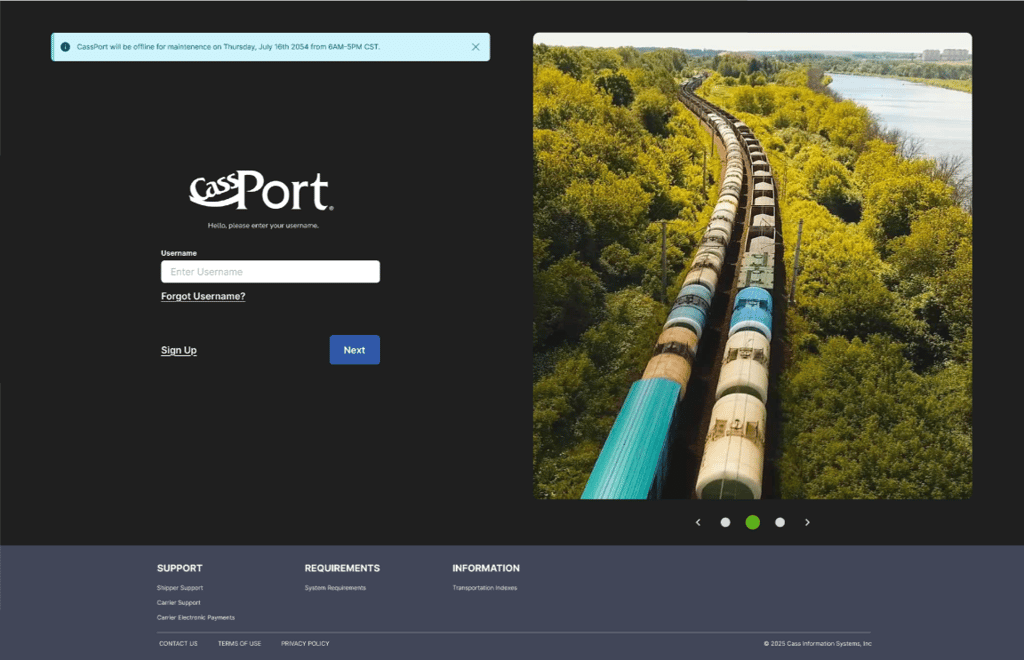
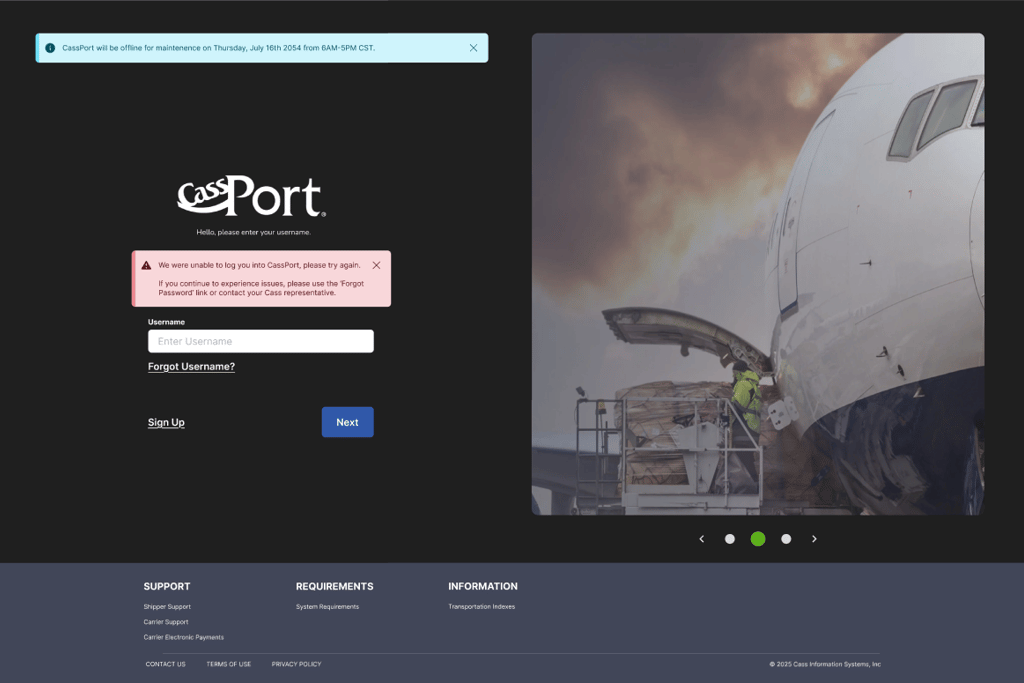
I changed the layout so the logo on the left first, the way a user usually reads left to right. I also separated the single step of signing on with the user name and password and refocused the first step to just be on the username. The separation of concerns allows users to focus on one thing at a time and helps them to clearly see how to sign up right away in the event they don't have an account.
The page now has a true sign in flow that separates the concerns of the username and password
The static image of the original was replaced with a carousel design pattern so if the marketing team needed to advertise an event, they would have a set resolution to design against which would look more polished and intentional
The image quality is greatly increased which gives a more professional appearance
The images in the carousel also rotate through all of the transportation style of the Freight Division, which is the division of Cass that the tool lives under
The footer was revamped to be easier to read and separated into sections to help describe their value to the user
Re-design overview
👉 Additional Focused Changes

New Sign In Flow with Separate Concerns

Additional Needs
After reviewing the updated designs with the Senior Developer on the project, two additional items needed to be taken into consideration: Site Maintenance Messages and Failure to Sign in. I utilized standard information and error messaging components for those messages with intentional placement so they could both appear without conflicts.
Conclusion
Design reviews were well-received, and stakeholders approved the updated designs to move forward into development. I facilitated the design handoff to the Lead Developer, ensuring documentation, component specs, and accessibility considerations were clearly outlined. Implementation is scheduled to begin before the end of 2025, marking the next step in bringing the improved experience to production.
Reflection
This project was straightforward yet highly impactful, as it focused on the very first step customers take when accessing the CassPort suite of applications. The redesigned experience not only allows marketing messages to appear more frequently but also better supports first-time users as they engage with the platform.
Through this work, I gained a deeper understanding of Cass’s validation services and the unique challenge of layering modern design and interaction patterns on top of legacy systems exposed to external users. Looking ahead, the experience could be further enhanced by rendering marketing messages in HTML with active links, enabling users to seamlessly navigate to event or campaign pages.
Contact
Get in touch for collaboration opportunities.
📩 slivkakathryn@gmail.com
© 2025. All rights reserved.